Welcome! If you're hopping today with Club Scrap, you've probably just left Wendy's blog. If not, and you'd like to start at the beginning, Karen started us out today. And there's always Club Scrap's papercrafting site to keep you busy!
This month's kit from Club Scrap, "Pattern Play," features masculine green/gray papers and chunky, graphic stamp images. In addition to masculine- and formal-feeling cards, I tried to mix up the results to show how it's possible to move the papers and stamps into a lighter and even a more elegant-feel.
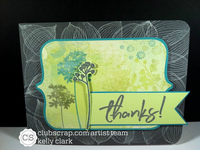
My first card uses one of the stamps from the kit, stamped in white on a dark gray cardstock base, to set the stage for a tag I picked up somewhere for a whole .25. I mounted the tag onto a piece of teal paper from my scrap bin and placed it in the center of the card. I stamped one of the sentiments from the kit in gray and mounted it to more of the scrap. Finally, I stamped one of the floral images from the "Stamped Bouquet" set in gray, mounted it along the left side of the sentiment. You know I can't leave well-enough alone, so the floral images all got a little Spectrum Noir clear sparkle added to them.
I'd say this card straddles the line between feminine and masculine.
This month's kit from Club Scrap, "Pattern Play," features masculine green/gray papers and chunky, graphic stamp images. In addition to masculine- and formal-feeling cards, I tried to mix up the results to show how it's possible to move the papers and stamps into a lighter and even a more elegant-feel.
My first card uses one of the stamps from the kit, stamped in white on a dark gray cardstock base, to set the stage for a tag I picked up somewhere for a whole .25. I mounted the tag onto a piece of teal paper from my scrap bin and placed it in the center of the card. I stamped one of the sentiments from the kit in gray and mounted it to more of the scrap. Finally, I stamped one of the floral images from the "Stamped Bouquet" set in gray, mounted it along the left side of the sentiment. You know I can't leave well-enough alone, so the floral images all got a little Spectrum Noir clear sparkle added to them.
I'd say this card straddles the line between feminine and masculine.
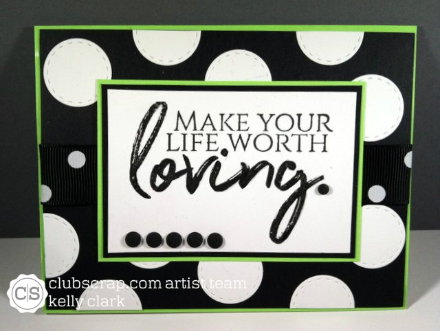
Next is a card I pushed toward feminine by using the repeated round shapes with the kicky color combination of bright green and black. (The combination is one I often see on summer sun dresses.) I used all supplies from the kit for this card except for the circle die I used to make the white circles and the Glossy Accents I used on the word "loving."
I think I'd send this card to a gal pal who is going through a difficult time - relationship, job, dieting - as a pick up. (I'm not sure the dieting thing makes life worth loving, but that's what the stamp said, so I went with it!)
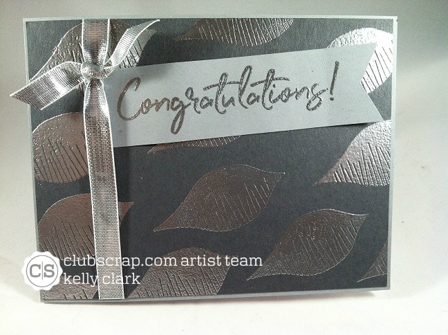
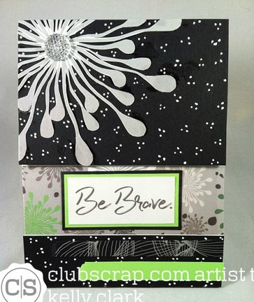
So here's where I see the cardstock as being elegant in addition to masculine. I created a card base with light gray and mounted onto it a panel of darker gray I made just slightly smaller than the card itself.
I stamped the darker gray panel with one of the leaf stamps and embossed them in silver. I added silver ribbon and a silver-embossed sentiment, all ready to give to a happy couple who has NO IDEA what they are about to embark upon!
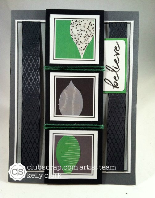
Heading back to masculine, this card features all materials from the kit except for the twine and the sliver of green seen behind the sentiment.
This card is 5 x 7 with a base of medium gray. I triple-matted the next layer which also includes ribbon from the kit. I used one of the panels from the cut-aparts, matted slightly larger than the actual size of the card, and wrapped with green twine I had on my desk. My can't-leave-it-alone moment was Glossy Accenting the leaves in the squares. (You'll remember the Glossy Accenting verb from a previous post!)
The sentiment is appropriate for encouragement.
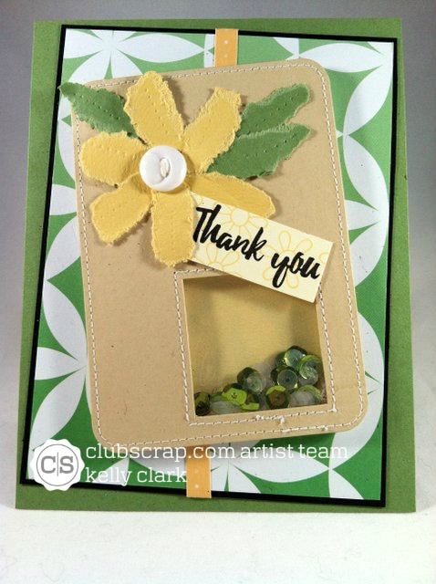
The card below is pretty darned feminine, what with the flower and all the sequin doo-dads in the window. I've had the floral, feature piece waiting for the right moment for eons. Thank goodness this interesting floral paper showed up in the kit! (I only need Club Scrap to surprise me with the right papers about 7,652 more times to empty out one of my embellishments boxes. Please get on that soon!)
The sentiment and the decorative papers are from the "Pattern Play" kit. The rest of the card is stuff from my stash.
The sentiment and the decorative papers are from the "Pattern Play" kit. The rest of the card is stuff from my stash.
 |  |
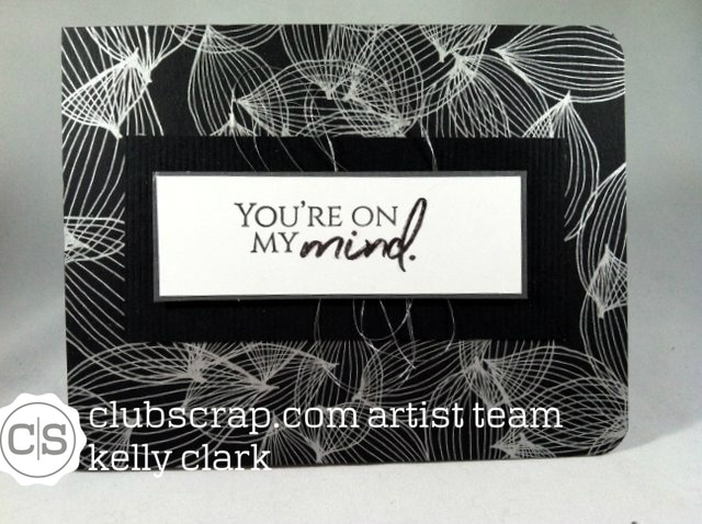
Below is another instance of the cardstock moving toward elegance. It is really hard to tell here because of the lines on the card front, but there is a slug? quantity? ration? glop? clot? mess? swirl? of silver thread behind the sentiment. (Someone please tell me what word I'm looking for so I don't look like a complete idiot more than a couple of days!)
I Glossy Accented the word "mind" and rounded the outside corners to finish off the card.
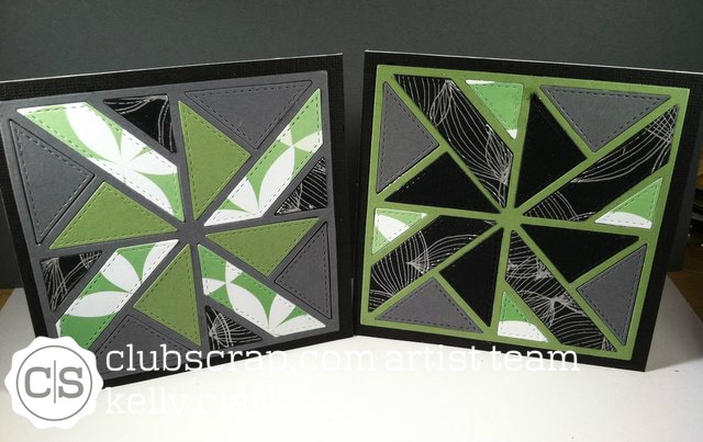
Below are a couple cards that I either didn't like or didn't complete. I just got the quilt die and thought I'd try it with the papers from the kit. The cards are 4.25" x 4.25." I felt that they looked a little haphazard, so I set them aside. In the future, I'll add sentiments on them and use them for gift cards.
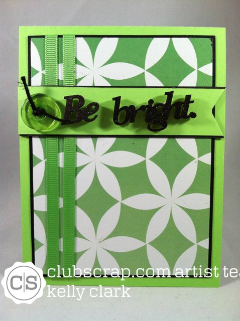
The last card uses the bright green paper that I had a hard time using. I created a double-matted panel to go on top of the bright green card base. I used the green ribbon from the kit and added a couple elements from my stash - the green button with twine and wood words "Be bright" 'cause, well, the paper is bright.
The last card uses the bright green paper that I had a hard time using. I created a double-matted panel to go on top of the bright green card base. I used the green ribbon from the kit and added a couple elements from my stash - the green button with twine and wood words "Be bright" 'cause, well, the paper is bright.


 RSS Feed
